What should be on a SLI dashboard
SRE practices and particularly the observability part help us keep a clear head by focusing on few key signals that matter, those that should reflect customer happiness. But despite SRE being around for more than a decade, not all related people are onboard with the practice; some hesitation does come from poor implementation of the observability part[citation needed], giving various stakeholders feeling of losing insight into their services. Hence, to drive adoption, we should do better with visualizing SLIs that are supposed to replace the non-customer-centric metrics1 as center of attention. This post tries to dive into what makes a good SLI dashboard and why. In the following text, I might use SLI and SLO interchangeably to refer to the thing that show customer happiness2; you know what I mean and anyone can look up their exact definition to avoid confusion.
What is an SLI/SLO/ErrorBudget dashboard?
In short, it is a dashboard that provides proper context for various stakeholders to determine health of a service through static and dynamic information provided there. Ideally, it should be a one-stop shop for most stakeholders, with the occasional need to drill down into fine-grained, stack-specific telemetry to decide why something happened. But who are these stakeholders? The immediate stakeholder that comes to mind is the very team that builds and maintains the service, relying on error-budget burn-rate-based alerts as primary source and checking this dashboard as first place to access their service. Adjacent teams can be stakeholders too, especially the consumers of those services (which would be your actual customers), they may need to take this input in their triage, or try to correlate historical changes. Last but not the least are the leadership team, from the immediate manager up to various levels, either with direct access to these dashboards, or in form of quarterly SLO compliance reports, acquired information can be crucial to longer term planing. For the rest of this post, think about any stakeholder aside from the owner team, arriving at your service’s dashboard from a link in middle of some report, chat or email, you should include enough context and reference so that the person (if not lazy!) can find their way to most generic questions.
What to include in an SLI dashboard?
I have implicitly assumed that each service has it’s own dashboard, with one or more SLIs in that page. This is a good general practice and suits most services and teams, adapt to your context when it no longer makes sense or there is too much data on a single dashboard.
Service Info
As basic and ordinary as it may sound, the service itself deserves some primary space in your dashboard. These information can be included:
- Name of the service
- A short one-sentence description of what it does, since it might not be apparent from the name
- Link to the code repository, useful to jump into code contribution history, language and stack
- Link to primary documentation source, where the architecture and flow is described
- Link to any auxiliary reference for further info, like a service directory, support board, etc.
SLI and SLO
By that I mean the actual service level indicator, some skip this and jump right into error budget, but having these is crucial:
- SLI spec, in plain text. It should include definition of SLI, the type (from the menu maybe?) and the SLO target preferably. Again, link to the SLI document for more details is appreciated, where whys and hows and gotchas are listed, and hopefully some error budget policy3 is described.
- SLI graph, showing trend of changes at least for the past 12 hours. This is a useful tool to quickly decide whether the current state is abnormal or something that has been happening for a while.
- Traffic volume as an underlay on the SLI graph. This is a complementary piece to provide more context for SLI trend, a question like “is this dip due to a spike in traffic?” can be answered in seconds with this piece present.
- SLO target as a fixed line in the same graph, to make SLO offending dips and spikes easily recognizable.
Remaining Error Budget
This is the key part for any non-immediate use case of this dashboard, to see how much of the budget you have left to spend. Using rolling window for budget tracking is the more popular choice[citation needed] and most teams use a 28 day rolling window for this purpose as their main window. Having other smaller or larger windows can be useful for alerting or reporting. But I will advocate having one organization/department wide window shared by all dashboards, this help reading and aligning different dashboards much easier. The remaining error budget can be displayed in different forms, all useful for different reasons:
- Remaining error budget as a single number for the generic window (28d please?) as well as other windows, expressed in percentage4 of budget left. This can be preferably color-coded to help identifying the state much easier.
- Trend of error budget changes over time. This helps to put the current remaining number is perspective and answer the question of “are we recovering or diving?” very quickly.
What else?
Think of context, does adding a link to another dashboard or an extra panel with list of upstream error budgets help the context? sure, if not, it will be noise, the very noise you should be trying hard to get rid of. And as with everything, you are better off starting small and simple, adding more information overtime, and occasionally taking a step back to look at the dashboard, and prune noisy parts if needed.
Example
I have deliberately put the example at the end. Platforms in each company may differ but the basic panels and principles are often universal enough, and also it is hardly a rote templatable work, the best dashboard would be the one you adapt to the needs and style of your company. Here is an example of all of the above put together:
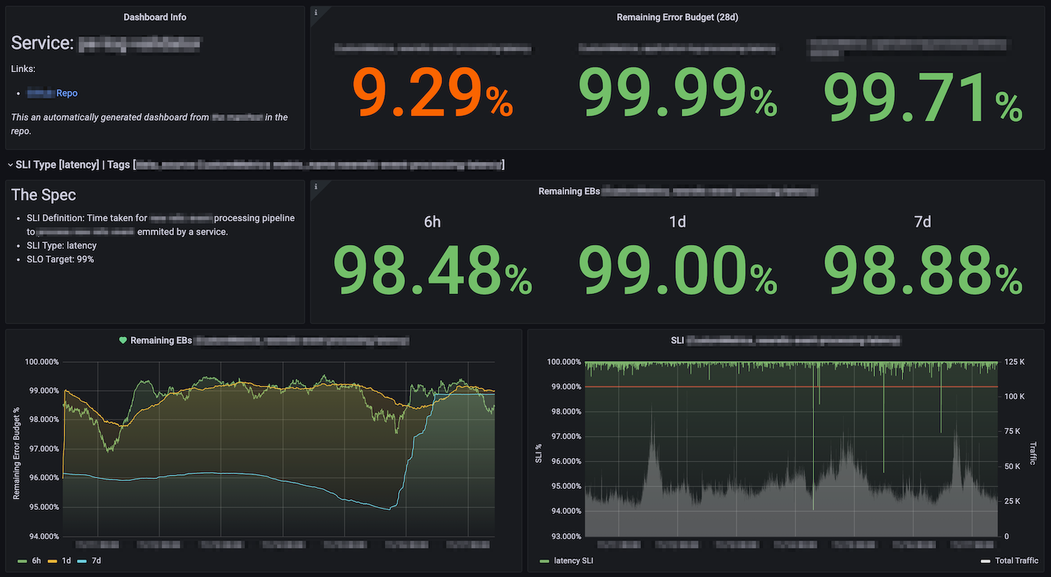
On first row you see service name, and relevant links, as well as remaining error budget for 28 days of all SLIs for that service. Then a (collapsible) row per SLI, where there is text panel for SLI Spec, and the remaining error budget for smaller windows. Then you find error budget graphs as well as SLI graph with total traffic (on different axis to help with different scales) as underlay and SLO as a red line showing the threshold.
Have you made an SRE dashboard that you are proud of? that the 3am you can make sense of it when woken up by a page? share it with the world, comment below this post!
Like system metrics, uptime of machines or components or CPU usage of something. Customers don’t care what is the CPU usage of your machines, they care about their experience. ↩︎
With emphasis on “should”, as my manager likes to say. Whether they actually do represent customer happiness or not, depends on how successful you have been to describe and capture key user journeys in your SLIs. ↩︎
This is the part were everyone has already agreed upon what happens if the service runs out of budget. ↩︎
I have seen some dashboards that have remaining budget expressed in minutes or hours, and I don’t get them! They might be remnants of
uptimedays, but whatever the rationale, they are counter intuitive and cognitively more taxing to parse and compare. ↩︎